National Resident Matching Program
Website & Brand Expression
What We Did
- Branding
- Digital Strategy
- Information Architecture
- User Experience Design
- Visual Design
- Website Development
- Website Maintenance
The National Resident Matching Program (“The Match”) is a preeminent organization, relied on by over 50,000 medical students and the programs and hospitals that serve them every year for The Match, their residency and fellowship match process.
After a thorough discovery process we learned that the website wasn’t meeting the needs of any stakeholders— the students, programs or even the internal team. It hadn’t kept up. The site played a key role in guiding students and programs through the stressful and time-bound process, and it was critical that the site guide the users through the process, and it was difficult to use.
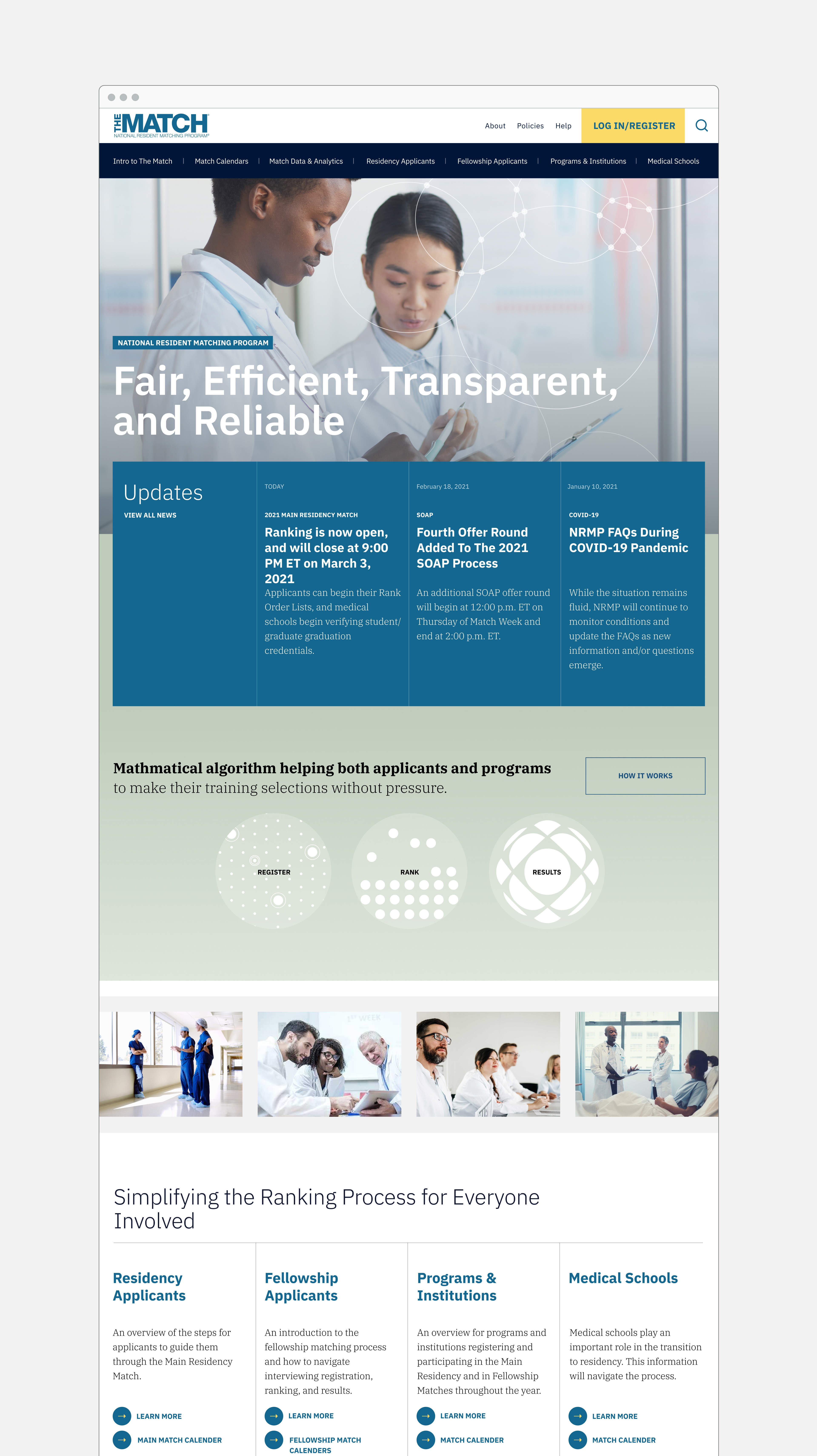
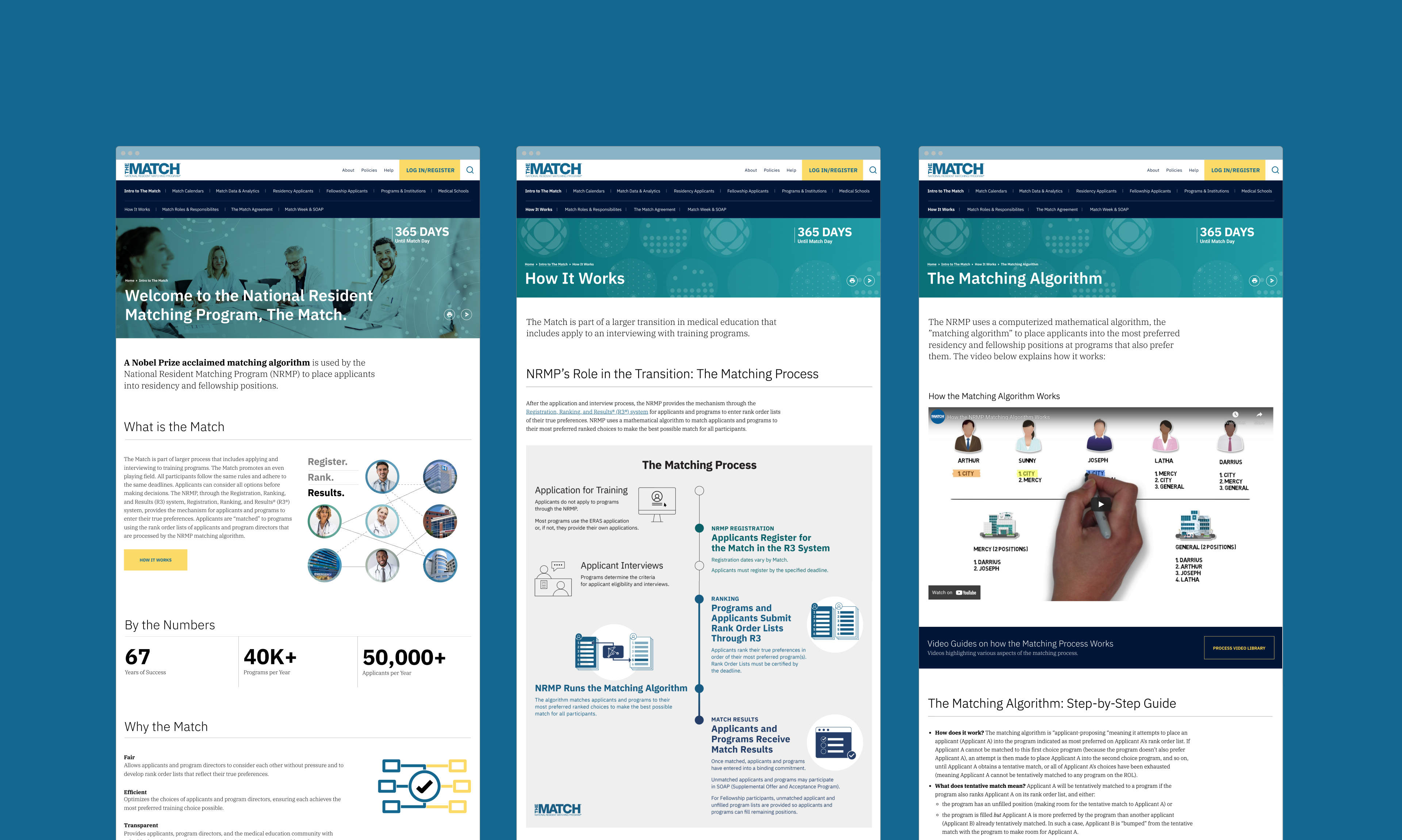
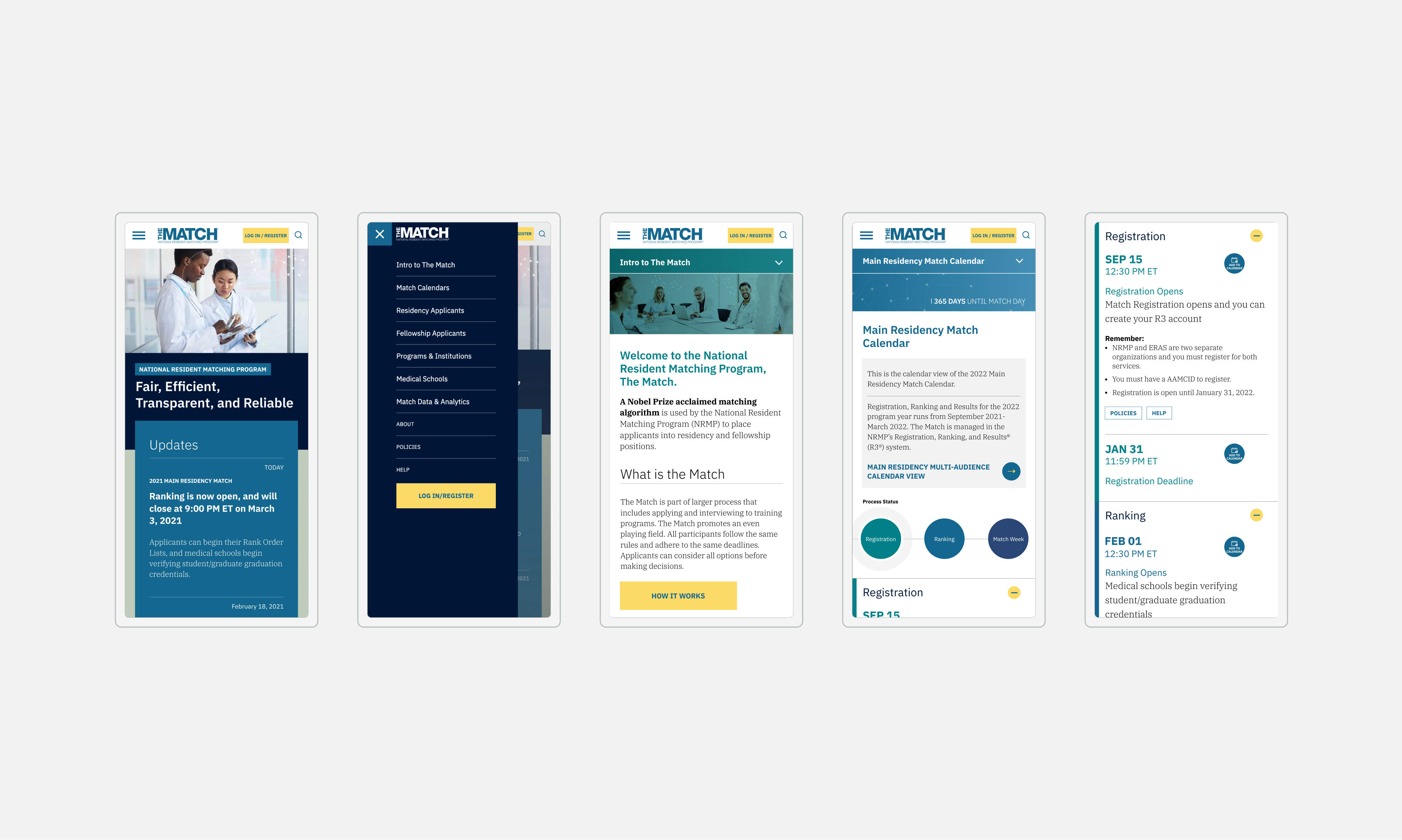
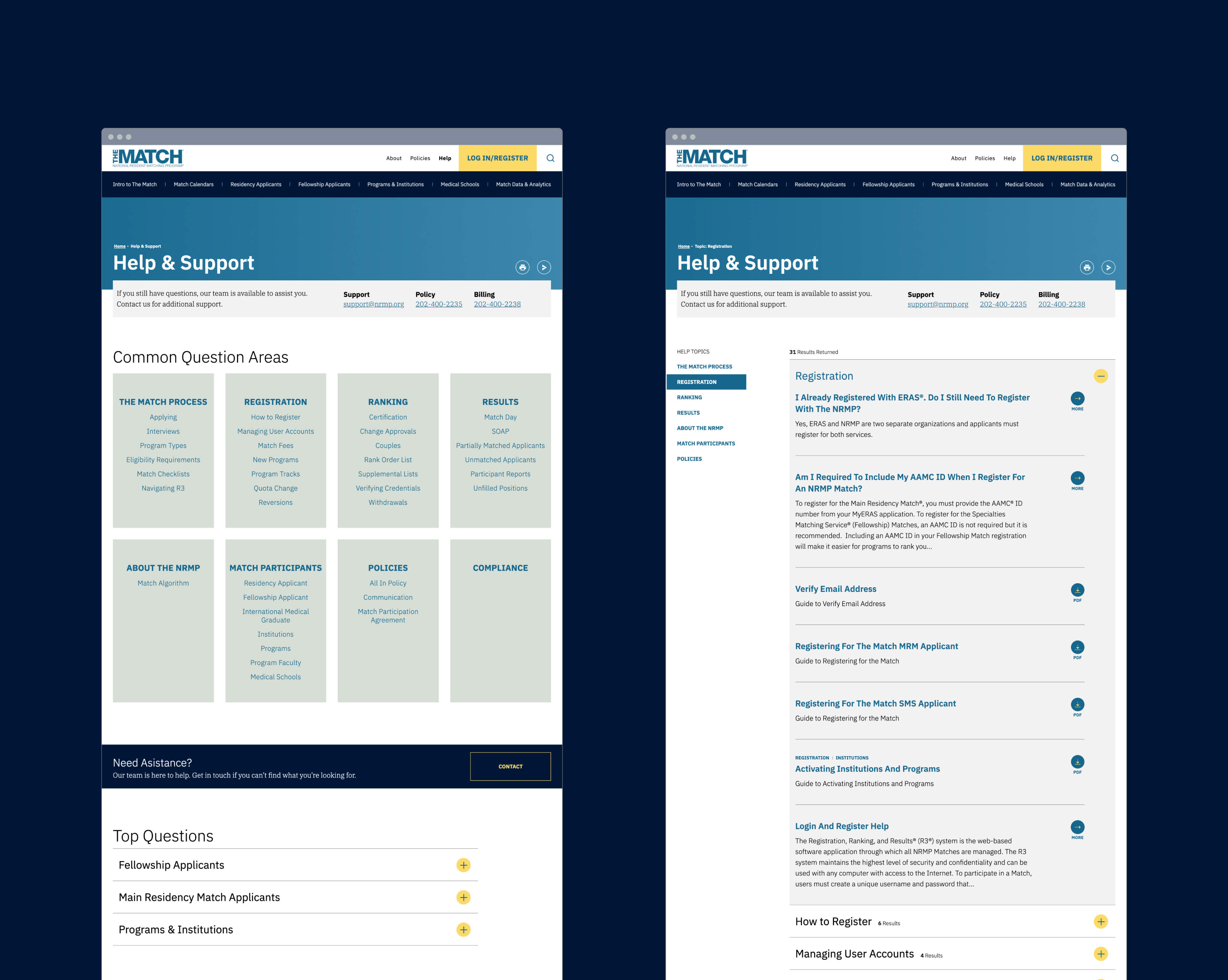
IOP reimagined and re-architected the website, making it modern, visual and interactive, streamlining the experience and speeding visitors to the information they seek — educating on the process while making the complex understandable. A key priority was helping users complete the process on schedule so we focused on surfacing the right information at the right time, reducing stress for applicants and programs alike. In addition, we created an extensive help center, allowing users to find what they needed rather than call or chat with the organization. In the most intensive week of the process, support call and chat volume decreased 46% year over year, a measurable success.
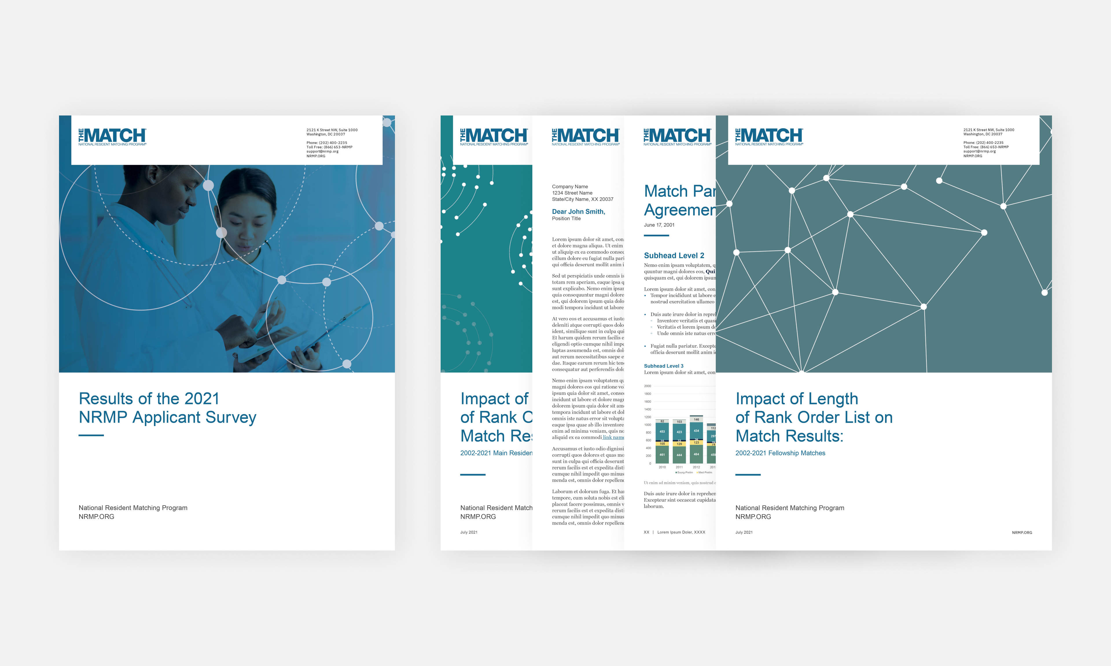
This update extends into the internationally focused site for a growing segment of the business as well as supporting materials such as presentations and reports.
We continue to partner with The Match to continuously improve and enhance the site. This work was recognized in the American Web Design Awards.
