3 Building Blocks to Optimize Your Website
Your site reflects your company, your products, your services and ultimately your brand. Could it inadvertently be turning people away?
Website visitors want instant gratification — “Where is the information I want and what are the fewest clicks to get it?” If you make them work to figure it out frustrated users will go elsewhere.
Of course, strategically developed, clear messages, and well written—and it’s important to be visually appealing, polished and professional. Don’t forget accessible. So much to do, where to start? To engage and keep visitors on the site, here are three “building blocks”—the fundamental elements to get right:
1. Usability
Your site visitors come to you for a reason—don’t irritate them with a poor experience. Any page could be a visitor’s first or only impression. Broken, slow, or poorly constructed pages will leave your visitors frustrated and encourage them to leave.
Making a site highly functional for a variety of end users means some complex considerations during development and on the back end. Design, messaging and site build combine to make a seamless user experience (or UX in digital speak). How easy is it to visit and use the site? Does it act in ways the user will expect?
This isn’t tied to which technology you employ (which should be invisible to the user). Professional strategy, UX, visual design, and development combine to anticipate what it will be like to visit and use the site as it’s created and then deliver that vision. Consider how your audience is likely to visit. We find mobile is typically 30% or more of corporate site visits — and growing. It is no longer optional. It’s critical to engage a team that is experienced designing and developing to current web standards, proofreading rigorously, and testing regularly. Every page should be fast and functional, because any page could be a visitor’s first or only impression.
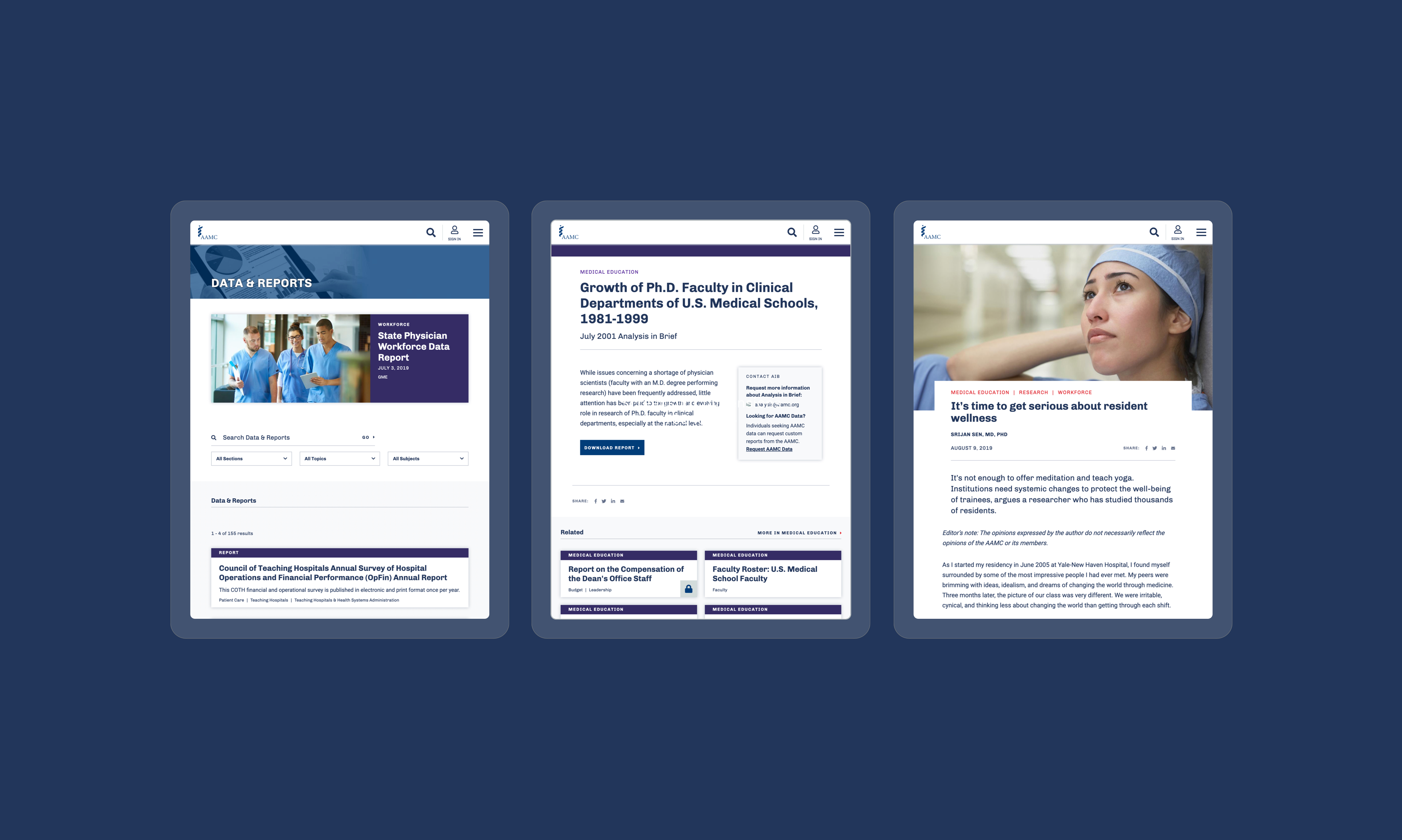
And, think about all site visitors. Making the site WCAG Accessibility compliant isn’t only good for people with disabilities, it is the right thing to work toward. As an example, below is the fully accessible site we created for the Association of American Medical Colleges.

2. Navigation
Navigation is a bigger concept than the list of links at the top, left or in a menu. Many site visitors come from search engines and referrals from other sites—‘side doors’ that bypass the home page and go directly to deeper pages. Can your users reasonably figure out where to look for key information from anywhere on your site? Can they accomplish what they want to do, on the device of their choosing? (If a tutorial is needed, the answer is no!)
Don’t make site visitors work to find their way. Use common terms and easily understood language—clever wording is often counter-productive.
Too much information can create as many difficulties as too little. Create succinct, logical navigation with clear hierarchy and consistent layouts that offer visual cues for functionality. When it comes to navigation: not too much, not too little and not too hard to find helps keep users on the site.
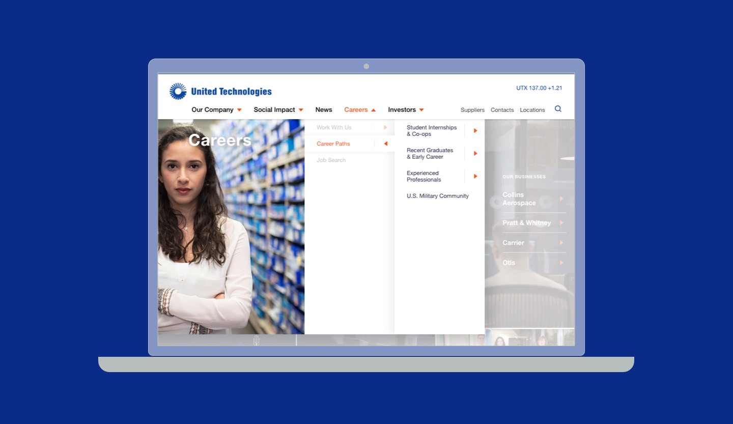
Below, complex navigation made simple—the United Technologies global navigation menu.

3. Visual Design
According to various studies, the brain processes visual information about 60,000 times faster than it does text. And, while it only takes about 1/4 second for the human brain to process and attach meaning to a symbol, by comparison, it takes an average of 6 seconds to read 20-25 words.
That’s why visual design—your website’s “look and feel”—is critical to getting information across and to keeping website visitors engaged.
If your organization has done its visual brand work, you’ll be working within that for site color palette, imagery and more. On the web page pay attention to the hierarchy of information. Are headlines, subheads and body text consistently treated? Does your page hierarchy of text and imagery cue what’s most important. Does the eye know where to go first?
Uncluttered layouts let messages shine, so white space is essential. Be sure not to fill your site with walls of words or other dense information. Break up text with high quality photos, statistics, infographics and video. Adding a little pizazz with video, motion and animation helps keep visitors engaged, as long as it isn’t over the top. Don’t underestimate visual appeal.
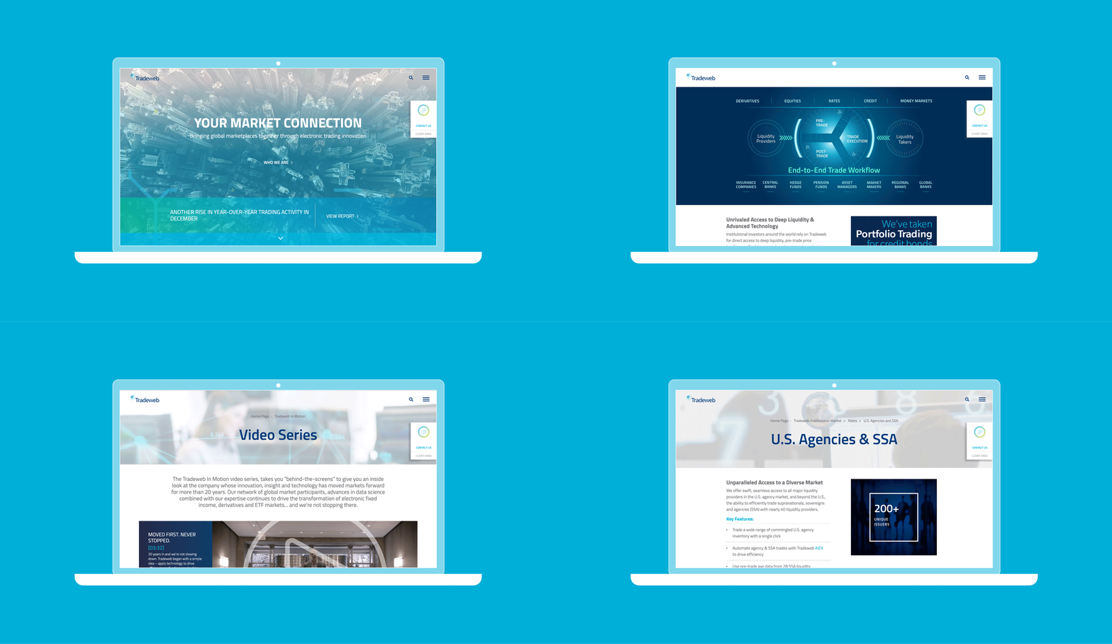
Below, Tradeweb‘s site which has a good combination of navigation options, whitespace, infographics, video and more.

What’s next?
It’s all too true that what site visitors see and do once they arrive is in your hands. With well-written, engaging content and these building blocks, you are well on your way.
Ready for more? Read The 7 Qualities of a Great Website. Check out our latest web projects.
Ideas On Purpose can help
Contemplating a website upgrade? Consider engaging an expert. Insight-backed digital communication is integral to the what we do. Check out some of the stakeholder-pleasing sustainability reports and branded impact communications as well as websites IOP has created—and email us to get in touch if you need help with yours.
Photo by Josh Calabrese on Unsplash